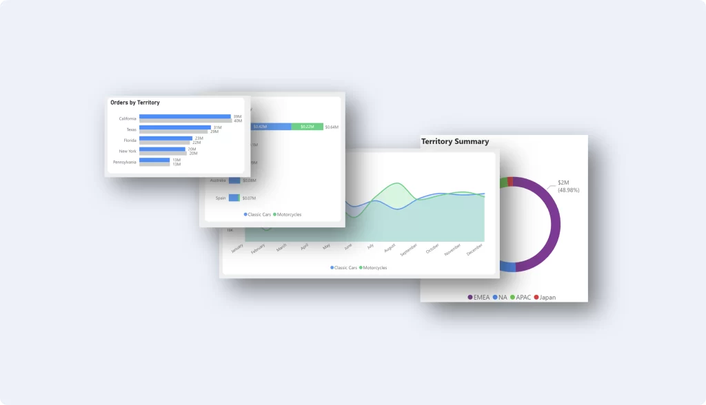
3D visual effects on dashboards are indeed gaining in popularity, as part of a broader trend towards making data visualization more engaging and insightful. This increase in popularity is driven by several factors:
1. Enhanced Data Representation
3D visual effects can provide a more nuanced view of complex data sets, allowing users to understand the depth and relationships within the data more intuitively. For instance, 3D charts and maps can represent multiple dimensions of data in a single view, making them particularly useful for spatial data analysis or when comparing large datasets with multiple variables.
2. Improved User Engagement
The dynamic and interactive nature of 3D visualizations can significantly improve user engagement. By offering a more immersive experience, 3D effects can make exploring data more interesting and enjoyable for users, which is crucial for applications where user interaction plays a key role in data exploration and analysis.
3. Technological Advancements
Advances in web technologies and graphics processing have made it easier and more efficient to implement 3D visualizations in dashboards. Frameworks and libraries that support WebGL (Web Graphics Library), such as Three.js, enable the creation of sophisticated 3D graphics that can run smoothly in web browsers without the need for specialized hardware.
4. Better Storytelling and Communication
3D visualizations can enhance the storytelling aspect of data presentation, making it easier to communicate complex information in a compelling way. They allow viewers to grasp trends, patterns, and outliers more quickly, facilitating better decision-making processes.
5. Increased Accessibility
With the proliferation of tools and platforms that support 3D visualization, it has become more accessible for organizations of all sizes to incorporate these elements into their dashboards. This democratization of 3D visualization technology is encouraging more companies to experiment with and adopt these features.
Challenges and Considerations
Despite their growing popularity, incorporating 3D visual effects into dashboards comes with challenges. Designers must ensure that these effects add value to the data analysis process and do not overwhelm or confuse users. There’s also the risk of misinterpreting data due to perspective distortion, which can occur with certain types of 3D visualizations. Consequently, it’s important to use 3D effects judiciously, ensuring they serve a clear purpose in enhancing the understanding of the data.
In summary, while 3D visual effects on dashboards are indeed gaining popularity due to their potential to improve data representation and user engagement, their implementation must be thoughtful and focused on enhancing the overall effectiveness of data visualization.
Download a Free Power BI Template
Get a head start on your next Power BI project with a free template and canvas blueprint.
