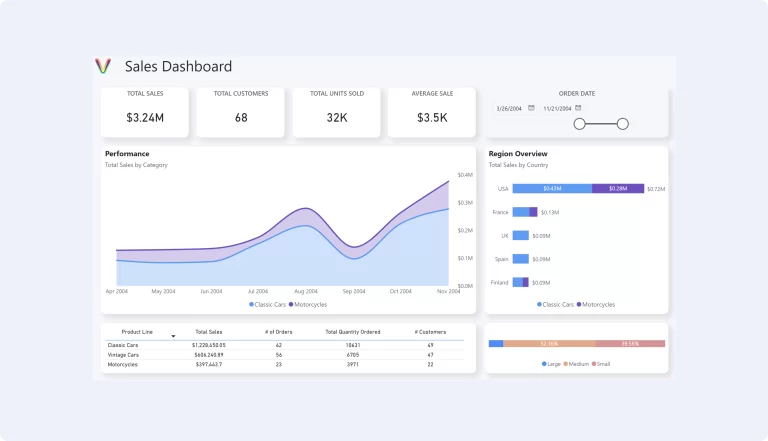
In today’s data-driven landscape, dashboards are essential tools for synthesizing complex information and providing actionable insights. Whether it’s for tracking sales, monitoring supply chain activities, or understanding customer behavior, a well-designed dashboard can transform decision-making processes. However, creating an effective dashboard requires more than just compiling data; it demands thoughtful design and strategic planning. Here, we delve into best practices for dashboard design that can elevate your data visualization efforts.
1. Know Your Audience
The foundation of any effective dashboard is a deep understanding of its intended users. Different stakeholders might require different data points, levels of detail, and interactivity. For instance, an executive might need a high-level overview of company performance, while a department manager may require detailed operational metrics. Tailoring your dashboard to suit the specific needs and objectives of its audience ensures relevance and usability.
2. Simplify and Focus
A common pitfall in dashboard design is overloading it with too much information. A cluttered dashboard can overwhelm users and obscure important insights. Prioritize clarity by focusing on key performance indicators (KPIs) that align with your audience’s goals. Use space judiciously, and don’t be afraid of white space—it can help direct attention to the most critical information.
3. Choose the Right Visualizations
Selecting the appropriate chart or graph type is crucial for effective data communication. Each visualization should be chosen based on the data type and the insight you wish to convey. For example, use line charts for trends over time, bar charts for comparisons, and pie charts for showing composition. Remember, the goal is to make the data as accessible and understandable as possible.
4. Employ Consistent Design Elements
Consistency in design elements such as colors, fonts, and layout helps in creating a cohesive and intuitive user experience. Use color with purpose—to highlight, differentiate, or categorize. Consistent visual hierarchies guide users through the dashboard logically, making the data easier to interpret and the insights more actionable.
5. Make It Interactive
Interactivity allows users to dive deeper into the data that interests them most. Features like drill-downs, filters, and hover-over details can transform a static dashboard into a dynamic analytical tool. This level of engagement not only enhances the user experience but also empowers users to explore and discover insights tailored to their specific queries.
6. Ensure Accessibility
Accessibility is a crucial, yet often overlooked aspect of dashboard design. Your dashboard should be usable for people with disabilities, including those who use screen readers or require keyboard navigation. Employing accessible design practices ensures that your dashboard is valuable to a broader audience.
7. Test and Iterate
Lastly, the development of a dashboard should be iterative. Initial designs should be tested with end-users to gather feedback on usability and effectiveness. Be prepared to make adjustments and refinements. An effective dashboard evolves over time, adapting to new data, changing objectives, and feedback from its users.
Conclusion
A well-designed dashboard is a powerful tool for insight and action. By following these best practices, you can create dashboards that not only present data in a visually engaging way but also drive informed decision-making. Remember, the best dashboards are those that are purpose-built, intuitive, and constantly refined to meet the evolving needs of their users.
Download a Free Power BI Template
Get a head start on your next Power BI project with a free template and canvas blueprint.
