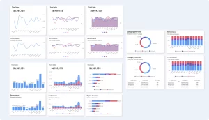
Power BI offers a vast array of visuals that allow users to turn raw data into compelling stories. Whether you’re a seasoned data analyst or a beginner, knowing which visuals to use can significantly enhance your reports. Below are the top 10 best visuals for Power BI that you should consider using in your next project! Each of the below visuals were built with the Vision Toolkit.
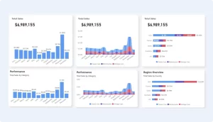
1. Bar Charts
Why they’re great: Bar charts are a staple for comparing data across different categories.
Best for: Displaying categorical data and making side-by-side comparisons.
Usage Tip: Use clustered bar charts for direct comparisons and stacked bar charts for understanding part-to-whole relationships.
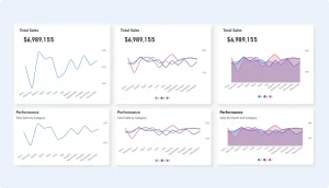
2. Line Chart
Why it’s great: Line charts excel at showing trends over time.
Best for: Visualizing data points over time, such as sales or website traffic.
Usage Tip: Combine with markers to highlight key data points, such as peaks and troughs.
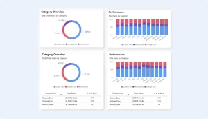
3. Pie Chart
Why it’s great: Pie charts are perfect for showing proportions of a whole.
Best for: Illustrating percentages or proportions in a dataset.
Usage Tip: Use sparingly and limit the number of slices to avoid clutter. Consider using a donut chart for a modern twist.
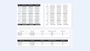
4. Matrix
Why it’s great: The matrix visual offers a powerful way to display data in a tabular format, combining the strengths of tables and cross-tabulations.
Best for: Summarizing data across multiple dimensions, such as sales by region and product.
Usage Tip: Use conditional formatting to highlight key data points or trends within the matrix.
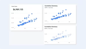
5. Scatter Chart
Why it’s great: Scatter charts are ideal for showing the relationship between two variables.
Best for: Identifying correlations, patterns, and outliers in data.
Usage Tip: Use color to represent different categories and size to indicate the magnitude of data points.
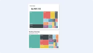
6. Treemap
Why it’s great: Treemaps provide a visual representation of hierarchical data, using nested rectangles.
Best for: Displaying part-to-whole relationships, especially when space is limited.
Usage Tip: Use for datasets with multiple levels of categories to visually display the hierarchy and proportions.
7. Buttons
Why it’s great: Buttons are excellent for understanding how an initial value is affected by a series of intermediate positive or negative values.
Best for: Tracking financial data, such as profit and loss statements, or illustrating the sequential impact of variables on a total.
Usage Tip: Use color coding to differentiate between increases and decreases.

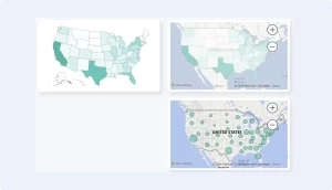
8. Map Visuals
Why it’s great: Map visuals bring geographic data to life, making it easier to see location-based trends.
Best for: Displaying data by location, such as sales by country or state.
Usage Tip: Use filled maps for broad geographic trends and ArcGIS maps for detailed geographic analysis.
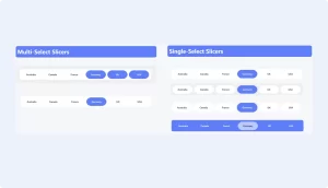
9. Slicer
Why it’s great: Slicers are interactive filtering tools that allow users to segment data dynamically.
Best for: Adding interactivity to reports by letting users filter data by specific criteria, such as date ranges or categories.
Usage Tip: Use slicers to allow users to customize the data they see, enhancing the report’s interactivity and user experience.
10. KPI (Key Performance Indicator)
Why it’s great: KPI visuals provide a quick snapshot of performance against a target.
Best for: Tracking progress toward key business goals, such as sales targets or website conversions.
Usage Tip: Pair KPIs with trend indicators to show performance over time or against benchmarks.
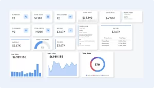
Download Power BI Templates
Get a head start on your next Power BI project with a template and canvas blueprint.
