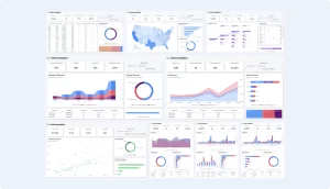
Top Power BI Dashboard Examples
Great reports reflect the needs of their specific audience. Whether they provide real-time data for day-to-day operations or strategic insights for C-level decisions, the best dashboards are always audience-centric.
All Power BI reports shown below were created using the Vision Toolkit. Browse our current themes and features to see how these reports can bring your data to life.
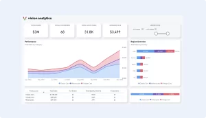
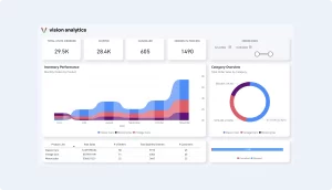
Power BI Sales Dashboard
A sales dashboard Overview: This dashboard offers a comprehensive view of sales metrics, allowing teams to monitor performance against targets.
Key Features:
- KPI Cards: Display essential metrics like total sales, revenue growth, and conversion rates.
- Trend Analysis: Line charts showcasing sales trends over selected periods.
- Regional Breakdown: Maps illustrating sales distribution across different territories.
- Who it’s for: Sales Managers and Executives
- Key Metrics:
- Total Sales
- Revenue Growth
- Conversion Rates
- Why it’s useful: Provides a comprehensive view of sales performance, enabling teams to monitor progress against targets and identify areas needing attention.
- Example Use Case: A sales manager uses this dashboard to track monthly sales trends, compare regional performances, and adjust strategies accordingly.
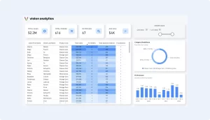
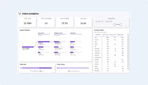
Product Sales Dashboard
This is how you replace your excel reports! Distribute Power BI dashboards instead of Excel documents. This will cut down the time it takes to produce reports, give the users real-time information, and allow them to self-service!
Key Features:
- Sales Summary: Summarizes revenues, gross sales, and returns during a specific period.
- Territory Overview: Displays sales, by geographic location.
- Progress Toward Goal: Visualize the overall sales performance vs goal.
- Who it’s for: Sales Representatives and Team Leads
- Key Metrics:
- Individual Sales Figures
- Targets vs. Achievements
- Client Acquisition Rates
- Why it’s useful: Allows sales members to monitor their performance, understand their contribution to team goals, and identify areas for improvement.
- Example Use Case: A sales representative reviews their quarterly performance, identifies top clients, and strategizes to improve underperforming areas.
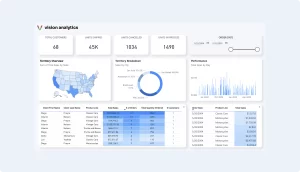
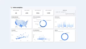
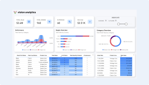
Regional Sales Dashboard
A regional sales dashboard is a specialized tool designed to monitor and analyze sales performance across different geographical regions. It helps businesses visualize data related to sales metrics within specific areas to better understand market trends, customer behavior, and regional performance variations.
Key Visuals:
- Shape Map
- Donut Chart
- Column Chart
- Table with heatmap
- KPI cards
- Date Range Filter
- Who it’s for: Regional Managers and Analysts
- Key Metrics:
- Sales by Region
- Market Penetration Rates
- Regional Growth Trends
- Why it’s useful: Highlights regional performance, helping managers allocate resources effectively and tailor strategies to specific markets.
- Example Use Case: A regional manager analyzes sales data to identify high-performing areas and regions needing additional support or marketing efforts.
Supply Chain Dashboard
A supply chain dashboard is a powerful analytical tool designed to provide a comprehensive overview of the various components and performance metrics of a company’s supply chain operations. It visually presents critical data that helps managers and decision-makers monitor and optimize the flow of goods, services, and information from procurement to delivery.
Key Features:
- Inventory Levels: Real-time tracking of stock across warehouses.
- Supplier Performance: Evaluates suppliers based on delivery times and quality metrics.
- Logistics Monitoring: Assesses transportation efficiency and costs.
- Who it’s for: Supply Chain Managers and Operations Teams
- Key Metrics:
- Inventory Levels
- Supplier Delivery Times
- Logistics Costs
- Why it’s useful: Provides insights into the supply chain’s efficiency, helping to identify bottlenecks and optimize operations.
- Example Use Case: An operations team uses this dashboard to monitor inventory turnover rates and streamline supplier deliveries to reduce costs.
Client Journey Dashboard
A customer journey dashboard is a strategic tool used to visualize and analyze the path that customers take from their first interaction with a brand to their eventual outcome, whether it’s a purchase, subscription, or another form of conversion. This dashboard helps businesses understand customer behaviors, preferences, and pain points at various stages of the customer lifecycle.
Key Features:
- Funnel Visualization: Tracks the progression of leads through various stages.
- Engagement Metrics: Monitors customer interactions across multiple touchpoints.
- Churn Analysis: Identifies patterns leading to customer attrition.
- Who it’s for: Marketing Teams and Customer Experience Managers
- Key Metrics:
- Lead Conversion Rates
- Customer Engagement Levels
- Churn Rates
- Why it’s useful: Maps out the customer journey, identifying touchpoints that lead to conversions or drop-offs, enabling targeted improvements.
- Example Use Case: A marketing team analyzes the dashboard to refine strategies at stages where potential customers disengage, improving overall conversion rates.
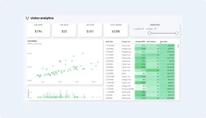
Product Correlation Dashboard
A correlation dashboard is an analytical tool designed to visualize and examine the relationships between different variables within a dataset. It helps identify how changes in one variable may influence or relate to changes in another, facilitating deeper insights into potential causal connections and dependencies.
Key Visuals:
- Scatter Plot
- Column Chart
- Table
- KPI Cards
- Date Range Filter
- Who it’s for: Data Analysts and Business Strategists
- Key Metrics:
- Variable Correlation Coefficients
- Trend Analyses
- Predictive Insights
- Why it’s useful: Identifies relationships between different business variables, aiding in predictive analysis and strategic planning.
- Example Use Case: An analyst uses the dashboard to explore how marketing spend correlates with sales growth, informing budget allocations.
Executive Dashboard
An executive level dashboard is a high-level management tool designed to provide senior executives and decision-makers with an at-a-glance overview of an organization’s performance across various critical areas. This dashboard consolidates key metrics and data points into a concise, easily digestible format, allowing leaders to quickly assess business health, identify trends, and make informed strategic decisions.
Key Visuals:
- Shape Map
- Donut Chart
- Scatter Plot
- Column Chart
- KPI Cards
- Date Range Filter
- Who it’s for: C-Level Executives and Senior Management
- Key Metrics:
- Company-wide KPIs
- Financial Performance
- Operational Efficiency
- Why it’s useful: Offers a high-level overview of organizational health, supporting strategic decision-making and performance monitoring.
- Example Use Case: The CEO reviews the dashboard monthly to assess company performance and guide strategic initiatives.
Client Monitoring Dashboard
A sales dashboard is a visual representation tool that aggregates and displays key sales data and metrics in real-time to provide a comprehensive overview of a company’s sales performance. It typically includes various widgets and graphs showing key performance indicators (KPIs) such as total sales revenue, conversion rates, average deal size, and sales pipeline status. This dashboard is designed to help sales managers and teams quickly monitor achievements, analyze trends, and make data-driven decisions to optimize sales strategies and improve performance. The dashboard can be customized to show daily, weekly, monthly, or quarterly data, providing insights into short-term results and long-term trends.
Key Visuals:
- KPI Cards
- Column Chart
- Bar Chart
- Donut Chart
- Date Range Filter
- Who it’s for: Social Media Managers and Marketing Teams
- Key Metrics:
- Engagement Rates
- Follower Growth
- Top Performing Posts
- Why it’s useful: Tracks social media performance, helping teams understand audience engagement and optimize content strategies.
- Example Use Case: A social media manager uses the dashboard to identify successful content and plan future
Why Choose Power BI? Integration, Aesthetics, and Ease of Use
As an Excel aficionado, you’ll appreciate how seamlessly Power BI integrates into your workflow. It offers advanced features for data transformation, collaboration, and secure access management at various levels. Dive deeper into our exclusive Vision Toolkit to elevate your dashboard crafting skills.
Power BI’s versatility allows for the creation of dashboards tailored to various organizational needs. By leveraging its robust features, businesses can transform raw data into actionable insights, driving efficiency and informed decision-making. For those looking to elevate their reporting capabilities, exploring these dashboard examples can serve as valuable inspiration.
Download Power BI Templates
Get a head start on your next Power BI project with a template and canvas blueprint.